When you purchase through links on our site, we may earn an affiliate commission (details)
Say It With White Space
by Antone Roundy | 1 Comment | Marketing, Web Design

It's been said a million times - your website needs more white space. Judging from how most websites look (including this one! More on that below), it needs to be said a million and one times.
I've been thinking a lot recently about how to use white space and related design elements to communicate more impactfully, and I thought I'd share some ideas.
The Power of White Space
Why is white space so powerful? There are two reasons. The first is the most obvious -- when you leave space around something, there's less to distract from it.
But there's more to it than that. When you leave space around something, the implicit message is that it's important enough to give more space than it needs. If you leave 2 parts white space to one part content, you're saying that the content deserves 3 times the space it consumes.
If that's the case, then maybe I ought to stop and read it.
Seth Godin put it well recently when he said:
When we finally have the attention of an audience, our instinct is to rush...
If you've got something to say, say it. Slowly. With effect...
...handle your message with the respect it deserves.
When we try to cram an entire novel into a single webpage, what message does that send?
- That no part of it deserves it's own space.
- That we're afraid that the message isn't interesting enough for anyone to click through to page 2.
- That we, ourselves, don't know which part of the message is the most important.
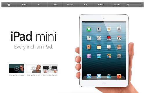
Take a look at the Apple homepage:

What's the message here?
- Even though Apple sells a lot of different products, the iPad mini is so important that it gets the whole page to itself (at least the part above the fold).
- The iPad mini is interesting enough that people will click through to page 2 for more information. (There are only 16 words in the main content area of page 1, even though there's plenty of space where more could have been added! Most internet marketing sales letters have twice that many words in the headline alone!)
- Apple is so confident that they've got the right message, they don't need to have a sidebar with links to all their other products -- just a minimal menu, plus some stuff for anybody who scrolls down.
Color
Another thing you may have noticed about Apple's homepage is the use of color. There's very little of it. There's a lot of white. The menu is gray. The text is black or gray. Most of the color is in the picture, with a little more in the video poster images.
How many webpages do you see with minimal color like this? Most people think they've got a great design if they have a boldly colored logo, menu, headline, background, etc., all harmonizing around a carefully selected color scheme.
Sure, it looks pretty. But every one of those beautifully colored elements is a potential distraction from the primary goal of the page.
I noticed this recently while working on a cleaner design for one of my websites. I'd switched to a low profile menu and header, but had kept the same saturated colors I'd been using before. When I tried a plain, gray menu, even though the menu hadn't been jumping out at me, I immediately noticed how much more easily my attention was able to go to the page content.
Add one boldly colored element in a page with minimal color, and you'll have no trouble directing your visitors' attention exactly where you want it to go.
Does that mean the design of everything but the key elements of the page should be flat and boring? No. Just understated. Apple's menu still has a nice, glossy look. It's just a glossy gray instead of a glossy blue.
Other Methods of Emphasis
The same principle applies to other methods of emphasizing page elements, like bold text, large fonts, animation, etc. The most effective way to draw more attention to one part of the page isn't always to make it louder, but to make the rest of the page quieter.

Out of Sight, but Not Too Far
Admittedly, not every page can be Apple's homepage. Not every page on Apple's own website looks like the homepage. Most of them have far more text.
There are a few reasons for this.
- Some things can be communicated better with images than others. The iPad mini is a physical product, so you can say a lot just by showing a nice picture of it. If your product is an eBook, a service, training, etc., you'll probably need to depend on words more.
- Not every page has the same job as the homepage. The homepage's job is to capture interest and send people off to the right part of the site for them. Other pages have the job of communicating details like features, benefits, technical specifications, prices, etc.
Still, the same principles apply:
And what's most important are the things that will lead your prospect to the next action you want them to take.
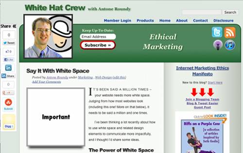
I mentioned earlier that this website is one of those that needs more white space. I'll be switching to a new theme here, as soon as I have it ready. Just about everything but the content will be deemphasized -- the header shorter, the sidebar narrower, etc.
It'll be a lot easier for visitors to accomplish what you come here for, and a lot more clear where to go next and how to get there.
In case you see this post after I've switched to the new theme, here's a screenshot of what the page looks like now:

If you want to be sure not to miss the new design when it's ready, use the form below to subscribe to this blog by email.


January 12th, 2013 at 6:48 pm
You're spot on with the Apple example. White is clean and makes your blog easier to read. Good post.