
When you purchase through links on our site, we may earn an affiliate commission (details)
Are Google’s Web Fonts Harmful to Websites?
If your web browser works with Google web fonts, this post will look a little different to you than usual. That's because I've replaced the font for the content with a handwriting style font named "Architects Daughter".
Traditionally, when choosing fonts for your website, you've had to take two precautions:
- Choosing fonts that most people have on their computers.
- Specifying a list of even-more-common alternate fonts to be used when your preferred font isn't installed.
This is necessary because web pages only NAME the fonts they want to use. They don't CONTAIN the fonts. If the font that's named isn't there, then obviously, it can't be used.
When you want to use a specific font, that leaves you with three choices: specify a reasonable fallback font, use an image instead of actual text, or give up and use something more common. Designers hate it when they have to do that.
What makes the problem even worse is that Windows, Mac and Linux don't all have the same fonts installed by default.
Enter Google Web Fonts
Google and others have found a way to address this problem by creating fonts that can be downloaded along with a webpage, without installing them on the computer. Google calls their implementation Web Fonts, and they offer it for free. Some other service make fonts available for free on a limited basis and/or charge for them.
So, is this a good thing or a bad thing?
Both.
It's good because it gives web designers the opportunity to use a greater variety of fonts without worrying about whether visitors have them installed.
But their are drawbacks to using web fonts.
First, if you're having difficulty reading this post...well, that's one of the potential drawbacks. More font choices means more chances to choose a hard-to-read font. (I was originally going to use one that's even harder to read than this one!)
If you're going to use fonts that are difficult to read, use them sparingly for decoration, and stick to more readable fonts for the bulk of your content.
Second, downloading a font slows down the loading of your page. When you select a font from Google Web Fonts, you'll see a graphic indicating the impact that your font choice will have on your page's load time.
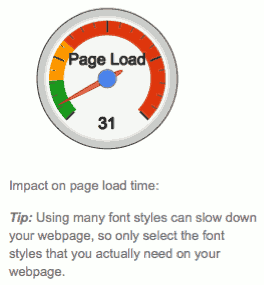
The image you see here indicates that the font I selected is in the "safe" green zone. However, be aware that ANY increase in page load time can lose visitors. I read recently that Google's research shows that increased page load times of even a small fraction of a second had a negative impact on their own results. The impact was small, but every little bit counts. (Sorry, I don't remember where I read that, so no link to the details.)
Plus, you should be aware that even Google's servers respond slowly sometimes. The more things that need to be loaded for your pages to display, the higher the odds of running into problems with one of them.
Conclusions
Google Web Fonts is pretty cool. And I think it's a good thing if used properly.
But if I ever put it to use (beyond this blog post), it'll probably be just for headlines and a few other specialized uses where I really need something different. For cases like that, I'd prefer Web Fonts to replacing text with images.
But for most web pages, a short list of common fonts should do the job just fine.


July 2nd, 2011 at 10:20 am
Think I'll just stick to verdana, etc. I like simple!